CSS 物件定位网页置中版面设计
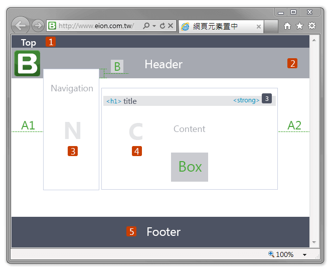
网页版面设计的文章介绍位置居中,让版面左右 A1, A2 留出一些边界看起来比较舒适。网页浏览按钮区 Navigation 在左侧浮动位置的向上偏移 B 重叠显示。版面 div.element-center 里面的元素,<h1> title、<strong> 的数字样式及 <div> Box 的位置居中(重点描述)。
title3
Box
HTML
<div class="element-center">
  <h1>title<strong>3</strong></h1>
  <div>Box</div>
</div>
CSS
div.element-center {
margin:20px 0px;
  padding:5px 10px;
  width:790px;
  height:150px;
  border:1px solid #c8cfe1;
}
div.element-center h1 {
margin:10px 0px;
  padding:3px 10px;
  font-size:24px;
  color:#4d5363;
  background-color:#e4e5e7;
}
div.element-center h1 strong {
margin:-10px 0px 0px 0px;/* 负数则垂直位置 -10px 往上移动 */
  padding:4px 10px;
  font-size:12px;
  color:#fff;
  background-color:#4d5363;
  float:right;
}
div.element-center div {
margin:0 auto;/* 元素水平置中 */
  width:250px;
  height:80px;
  font-size:28px;
  line-height:80px;/* 垂直置中值与 height 相同 */
  color:#4aa83b;
  background-color:#cacbd0;
  text-align:center;
}
网页版面主要区块
网页版面主要区块分为五个、Top、Header、Navigation、Content 及下方 Footer。
其中 Navigation 浏览按钮区块、Content 文章介绍区块包装在 wrapper 区块之内让位置居中于浏览器的视窗中,
并且 Content 区块的 CSS 设置 overflow: hidden 元素超出矩形格时或说重叠显示的方法可参考 overflow 的当内容超出元素的矩框时要如何展现有显示结果的比较。
网页下方 Footer 配合页面的高度设置、可以不拘内容的高度而位置于视窗下方。
HTML
<!DOCTYPE html>
<html lang="zh-TW">
<head>
<title>网页版面设计</title>
</head>
<body>
<div class="topNav">
  Top <!--(1)-->
</div>
<div class="header">
  Header <!--(2)-->
</div>
<div class="wrapper">
  <div class="leftNav">
    Navigation <!--(3)-->
  </div>
  <div class="content">
    <!--(4 Content)-->
    <h1>title<strong>3</strong></h1>
    <br />
    <div class="box-c">Box</div>
  </div>
</div>
<div class="footer">
  Footer <!--(5)-->
</div>
</body>
</html>
CSS
html{height:100%;} /* 页面的高度设置 */
* html body{height:100%;}
body{
margin:0;
  padding:0;
  min-height:100%; /* 浏览器的视窗大小改变时显示处理 */
  position:relative; /* 相对的位置 */
}
div.topNav{
  background-color:#4d5363;
}
div.header{
  background-color:#a6a9b1;
  height:100px; /* 高度的设置 */
}
Wrapper
div.wrapper{
margin:0 5%; /* 左右边距离 5% 版面置中 */
}
div.content{
  overflow: hidden; /* 元素超出矩形格时或说重叠 */
}
div.leftNav{
  width:200px; max-width:36%; /* 浏览按钮区域的宽度 */
margin:20px 20px 0px 10px;
  float:left; /* 元素设为在左侧浮动 */
}
Footer
div.footer{
  clear:both;
  width:100%;
  position:absolute;
  bottom:0; /* 设置位置于下方 */
  height:80px;
  background-color:#4d5363;
}
版面内元素居中范例
以上概略的网页版面以尽量简化细节来描述结构 Html 范例请由此 查看网页版面范例。
使用 Flexbox 伸缩盒配置居中的区块容器
div.center-block {
  margin:10px;
  height:100px;
  border:1px solid #d3d6d9;
  transition: all .15s linear;
}
div.center-block {
  display:flex;
  align-items:center;
  justify-content:center;
}
div.center-block:hover {
  height:120px;
}
div.center-block div {
  width:300px;
  height:50px;
  line-height:50px;
  font-size:24px;
  text-align:center;
  background-color:#f3dc80;
  transition: all .15s linear;
}
div.center-block div:hover {
  height:80px;
  line-height:80px;
  cursor:pointer;
}
简单居中范例请由此 查看伸缩盒网页版面范例。